Physical Address
304 North Cardinal St.
Dorchester Center, MA 02124
Physical Address
304 North Cardinal St.
Dorchester Center, MA 02124

The most expensive church-bulletin mistake is usually not a bad font choice or a weak image. It is choosing the wrong format and discovering too late that the content does not fit the structure. In Canva, the template category you start with affects page size, fold logic, content density, update speed, and print setup. For most churches, a church program template is the right default because it matches the bulletin’s core job: guiding one service. Move to a church brochure template when folding is part of the reading experience, and reserve church newsletter templates for longer, more editorial bulletins that genuinely behave like mini-publications rather than simple service guides.
The safest workflow is straightforward: decide the bulletin’s job first, choose Letter for a U.S.-centric print environment or A4 for international printing, decide the fold before you design any brochure layout, load your church’s Brand Kit, turn on margins, rulers, guides, bleed, and crop marks, limit announcements to a few items that matter this week, and export a proof at actual size before you hand off the final PDF Print file. That sequence aligns with Canva’s template categories, page-size guidance, print setup tools, and proofing recommendations, and it also matches church communication advice to keep bulletins clear, current, and easy to scan.
A bulletin is not just a page; it is a reading experience. Church communication sources repeatedly describe the bulletin as a guide or roadmap, which means your structure should be chosen around how worshipers will move through the content. Canva’s own template library reinforces that distinction by separating church program, brochure, and newsletter templates into different design categories with different use cases.
The decision path below turns those categories into a simple pre-design rule set. It is a synthesis of Canva’s official template groupings and brochure-fold guidance, plus church communication advice about clarity and content load.
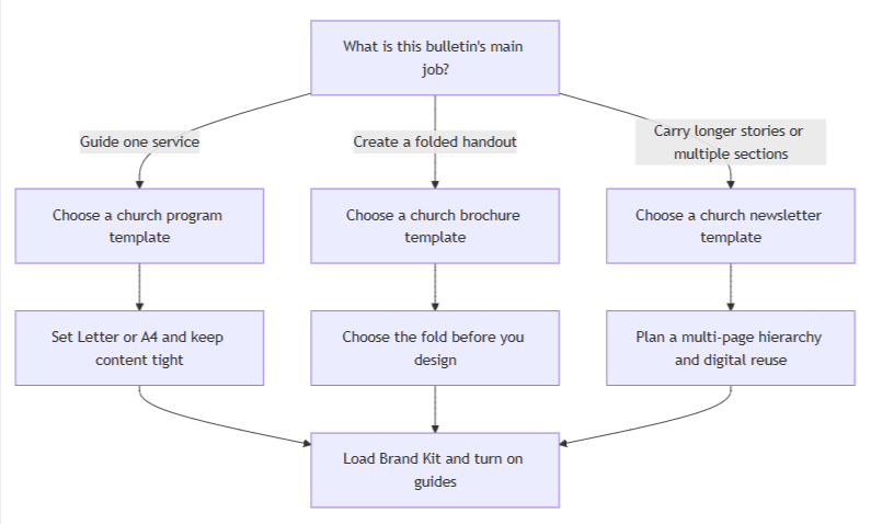
If you only remember one distinction, make it this: program equals service guide, brochure equals folded handout, newsletter equals longer editorial update. Once that choice is correct, the rest of the design process becomes much easier.
| Template type | Best use case | Typical page size or fold | Pros | Cons | Canva template examples or links |
| Church program | Standard Sunday bulletin, funeral program, special-service handout, or any layout whose main job is to guide one service. | Usually Letter or A4; often one sheet front/back or a bifold when you need slightly more room. | Closest match to service order, scripture, and a few practical details; usually the fastest weekly update for church staff or volunteers. | Feels cramped if you try to turn it into a mini-newsletter; too many announcements reduce recall. | Canva church program templates gallery. |
| Church brochure | Folded bulletin, welcome handout, guest guide, or layout where the panel structure is part of the experience. | Commonly Letter, A4, Legal, or DL, with half-fold, tri-fold, Z-fold, gate fold, or roll fold options. | Panels help categorize information, hide secondary content until the reader opens the piece, and fit more information without making one panel feel crowded. | You must choose the fold before designing; if the fold logic is wrong, redesign is common. | Canva church brochure templates gallery and official tri-fold brochure examples. |
| Church newsletter | Longer weekly or monthly bulletin with stories, ministry updates, multiple departments, or digital distribution beyond Sunday morning. | Usually a multi-page Letter or A4 PDF, often reused for email or digital sharing. | Best for an editorial rhythm: stronger sectioning, more room for stories, and easier reuse as email or downloadable PDF. | Requires tighter copy editing and hierarchy; cluttered, announcement-packed newsletters are easy to skim past. | Canva church newsletter templates gallery. |
Most halfway redesigns happen because the team starts styling before it settles structure. Canva’s own print guidance and church communication best practices point in the same direction: choose page size, fold, content hierarchy, and brand assets before you begin arranging boxes on a page.
| Check | What to decide before designing | Why it matters |
| Bulletin job | Is this a service guide, a folded handout, or a longer update? | Canva separates church programs, brochures, and newsletters because they solve different communication problems. |
| Paper size | Choose Letter or A4 first. | Canva supports both fixed sizes; A4 is used by most countries outside the U.S., Canada, and parts of Mexico, while Letter is the common North American standard. |
| Fold plan | No fold, half-fold, tri-fold, or another panel system. | Canva’s brochure guide says to know the fold before you design because the fold determines panel logic and reading order. |
| Announcement cap | Decide which items are truly important this week. | Tithely recommends focusing on a few key announcements because too many means people remember none of them. |
| Core assets | Gather the church logo, one sermon-series or seasonal image, contact details, giving details, and service times. | Brand Kit is designed to organize official logos, colors, fonts, and assets in one place for consistent use across a team. |
| Type and color system | Pick one headline style plus one highly legible body style, then set brand colors. | Canva Brand Fonts can define heading, subheading, and body defaults, and Canva Styles can test font and color combinations without rebuilding the design. |
| Guide system | Turn on margins, rulers, guides, bleed, and crop marks as needed. | Canva explicitly recommends these tools for professional-looking prints and warns about the “danger zone” near the edge. |
| Accessibility pass | Check contrast, text on images, icon use, and live text. | W3C requires sufficient contrast, warns against relying on color alone, and recommends text instead of images of text where possible. |
| Rights pass | Confirm ownership and licensing for photos, fonts, logos, and stock content. | Canva’s licenses are non-exclusive, third-party rights still apply, and uploaded fonts must be licensed for use and embedding. |
If you are still undecided on page size, fold, or how many announcements should fit, you are not behind; you are simply still in planning mode. It is much cheaper to resolve those decisions in a checklist than in a half-built design.
For churches, the design system should protect consistency, not make the bulletin harder to update. Canva’s Brand Kit exists to store official logos, colors, fonts, and other assets, while Brand Fonts can set defaults for headings, subheadings, and body text across the team. Canva’s Styles feature then lets you test font and color combinations from a controlled system rather than improvising every week.
That matters most for church admins and volunteer designers because the bulletin is usually a repeatable weekly workflow, not a one-off campaign piece. A simple system is easier to maintain, easier to proof, and far less likely to drift away from the church’s visual identity over time.
Use one church logo, one sermon-series image or seasonal worship image, and a small icon set only when it improves navigation. Pushpay recommends images tied to events or worship content because they build connection, and it notes that icons can help guide readers to specific sections. W3C’s guidance on color also means icons should reinforce labels, not replace them; readers should never need color alone to understand meaning.
If you want a consistent free icon family, Material Symbols is Google’s current official icon system, and Google’s guide recommends working with standard icon sizes such as 18, 24, 36, or 48 pixels. In a bulletin, that usually means small 18–24 px icons for calendar, location, giving, contact, or QR-related navigation.
Canva’s typography guidance is especially helpful for church bulletins because it emphasizes hierarchy, readability, and restraint. It notes that you can use different weights of the same family for versatility, that mixed weights enhance hierarchy, and that shorter lines are easier to read. The easiest bulletin-safe rule is therefore a single headline style plus a highly legible body style, or even one family with weight variation if your church prefers a quieter look.
Good Canva-friendly examples include League Spartan + Libre Baskerville for a structured but traditional look, Cinzel + Open Sans or Aileron for a classic church feel with modern readability, and Source Sans Pro + Open Sans for newsletter-style layouts that need clean scanability. Canva also warns that embellished script fonts become hard to read in longer stretches, so save script styles for a short accent line at most, never for body copy. Keep the palette anchored to Brand Kit colors, then add one neutral background and no more than one accent color for emphasis.
Here are sample text snippets you can adapt directly into a bulletin:
Header:
Sunday Worship
[Month Day, Year] | [Service Time]

Section headings:
Today's Scripture
This Week
Ways to Give
Need Prayer?
New Here?

Body snippets:
Message: [Sermon Title] • [Scripture Reference]
Community Dinner • Wednesday • 6:30 PM • Fellowship Hall
Give online or scan the QR code at the welcome desk
Questions? Visit the welcome desk after service
Church communication sources consistently describe the bulletin as a guide or roadmap, and that should shape your content order. The first panel or first visible screen should answer the congregation’s immediate questions: What service is this? What day is it? What are we doing today? What passage are we opening? After that, the bulletin can move into scripture, sermon context, and a small number of announcements. Practical information such as contact details, giving options, and other service times belongs later, where it is easy to find but does not compete with the worship guide itself.
A strong default order looks like this in practice: service title and date first; core program details second; scripture and sermon information third; limited announcements fourth; practical information last. If you find yourself shrinking type to fit more announcements, that is not really a layout problem. It is a prioritization problem. Tithely advises keeping to a few key announcements, and church newsletter guidance similarly warns that cluttered, announcement-heavy messages are easy to ignore.
A simple two-column structure often works best because it separates the main worship flow from secondary information. Canva’s own typography guidance notes that shorter lines are easier to read, and both Canva and Pushpay emphasize white space and uncluttered structure for scanability.
┌────────────────────────────────────────────────────────────┐
│ Logo   Service title   Date   Sermon-series image         │
├───────────────────────────────┬────────────────────────────┤
│ Core program                  │ Limited announcements      │
│ • Welcome                     │ • Event 1                  │
│ • Songs / prayers             │ • Event 2                  │
│ • Scripture                   │ • Volunteer opportunity    │
│ • Sermon title                │ • Giving reminder          │
├───────────────────────────────┴────────────────────────────┤
│ Footer: contact details • giving options • service times  │
└────────────────────────────────────────────────────────────┘
On a brochure, each panel can hold one of those blocks. On a newsletter, those same blocks can become clearly separated sections across multiple pages. The hierarchy stays the same even when the format changes.
Canva supports fixed Letter and A4 page setups, so choose your size before the file starts accumulating content. Letter is 8.5 × 11 inches, while A4 is 21 × 29.7 cm. Canva’s A4 size guide notes that A4 is used by most countries outside the United States, Canada, and some of Mexico, which makes the choice simple: if your office printers and paper stock are U.S.-centric, use Letter; if your church prints internationally, use A4.
Once the page size is locked, turn on the page-setup tools that prevent print surprises. Canva’s guide for guides and margins shows that you can add preset or custom guides from File > View settings > Add guides, display rulers, and work with margins, bleed, and crop marks. Canva also notes that margin guides sit wider than the “danger zone,” so keeping the logo, text, and other important elements inside those guides reduces the chance of accidental trimming.
Because you are not designing to one specific print vendor, a vendor-neutral workflow is best. Canva notes that not all office printers support full bleed or crop marks, so your safest baseline is to keep critical content well inside the safe area, proof the file at actual size, and then export a high-resolution PDF Print file. If your office printer or local print shop later asks for crop marks and bleed, export a second version with those options enabled.
A short export checklist:
The bulletin should feel like a guide, not a catalog. Canva’s white-space guidance explains that white space improves grouping, emphasis, and legibility, and Pushpay makes the same case in church-specific terms: a clean layout with visible white space helps people find key details faster. That is why body copy should sit on calm backgrounds, why sections should breathe, and why every extra line of filler text should be treated as a design cost.
Avoid placing normal body text over busy photographs. W3C’s accessibility guidance requires sufficient contrast for text on images as well as flat backgrounds, and NN/G recommends overlays, blur, shadows, or outlines if text must sit on an image. In practice, the safest bulletin rule is simple: keep body copy on solid or lightly textured backgrounds, and reserve text-over-image treatments for short headings only.
For readability and accessibility, keep normal body text at a minimum 4.5:1 contrast ratio; only large text gets the looser 3:1 threshold. Do not rely on color alone to signal meaning, and do not turn important service information into flattened image text when live text will do. W3C explicitly says to use more than color to convey meaning and to prefer text over images of text so readers can adjust presentation.
For copyright and asset sourcing, use church-owned logos and photos whenever possible, store them in Brand Kit, and treat Canva stock as licensed production material rather than proprietary church branding. Canva’s Content License Agreement and copyright guidance make clear that stock content is used under a non-exclusive license and that designs containing third-party content remain subject to those third-party rights. Canva also says uploaded fonts must be licensed for your use, and its font-upload error guidance specifies that the font should be licensed for embedding.
If you choose the format before you choose the decoration, your bulletin gets easier to design, easier to update, easier to print, and easier to read.
Save this before you choose your bulletin layout.